Type: University Project
Role: Communication design, Speculative product and UI design
Tools: Adobe Illustrator, Adobe InDesign
Year of completion: 2021
Role: Communication design, Speculative product and UI design
Tools: Adobe Illustrator, Adobe InDesign
Year of completion: 2021
The Challenge
In this university project, we were required to create a marketing brochure for a fictional, future piece of technology. For me, the challenge here was two-fold: I had to conceptualise a product I would like to see in the future, and then design a visually appealing brochure to communicate this product to prospective customers.
The CONCEPT
The first step of the process was to come up with a suitable product. I began by reflecting on the state of modern technology and current trends and thinking about a product design that could address a future need.
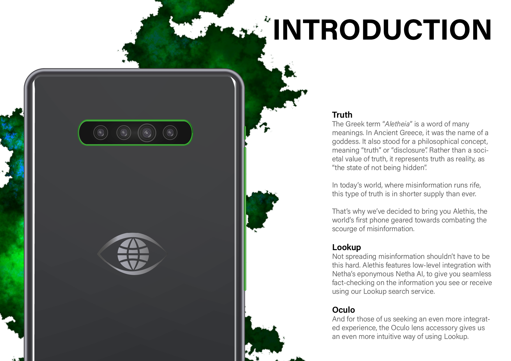
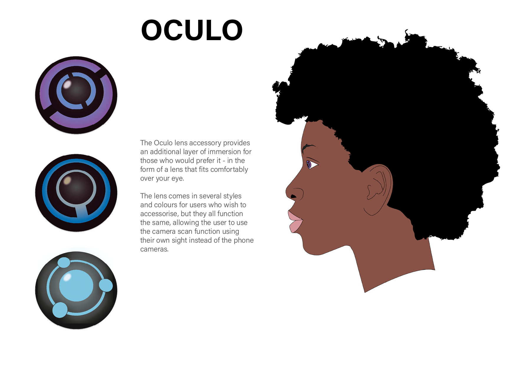
The proliferation of misinformation had, by that point, already become a serious problem in society. It had become increasingly difficult to verify information received online, a problem which only worsened once this digital misinformation crossed over into the real world. In the modern day, with current advances in large language models like GPT and image-generating generative adversarial networks like DALL-E and Midjourney, this problem has only worsened. I decided to create a smartphone centered around the verification of misinformation. It would be not only able to verify information and claims in the digital domain, but also, through its camera and an ocular lens accessory, in the real physical world.
I initially decided to name it Netha, after the Sinhalese word for eye (නෙත) to evoke the idea of truth (i.e. the all-seeing eye), which you can see in the logo of the device. However, I finally decided to change the name to Alethis, based on Aletheia, the ancient Greek personification of absolute truth.
The BRochure
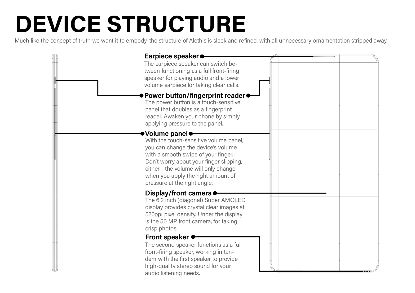
I created several visualisations of the product to use in my report. This included the illustrations of the body of the device (see above) in a photorealistic style, as well as schematics of the device, and finally UIs showing how the fictional device's operating system and applications would function.
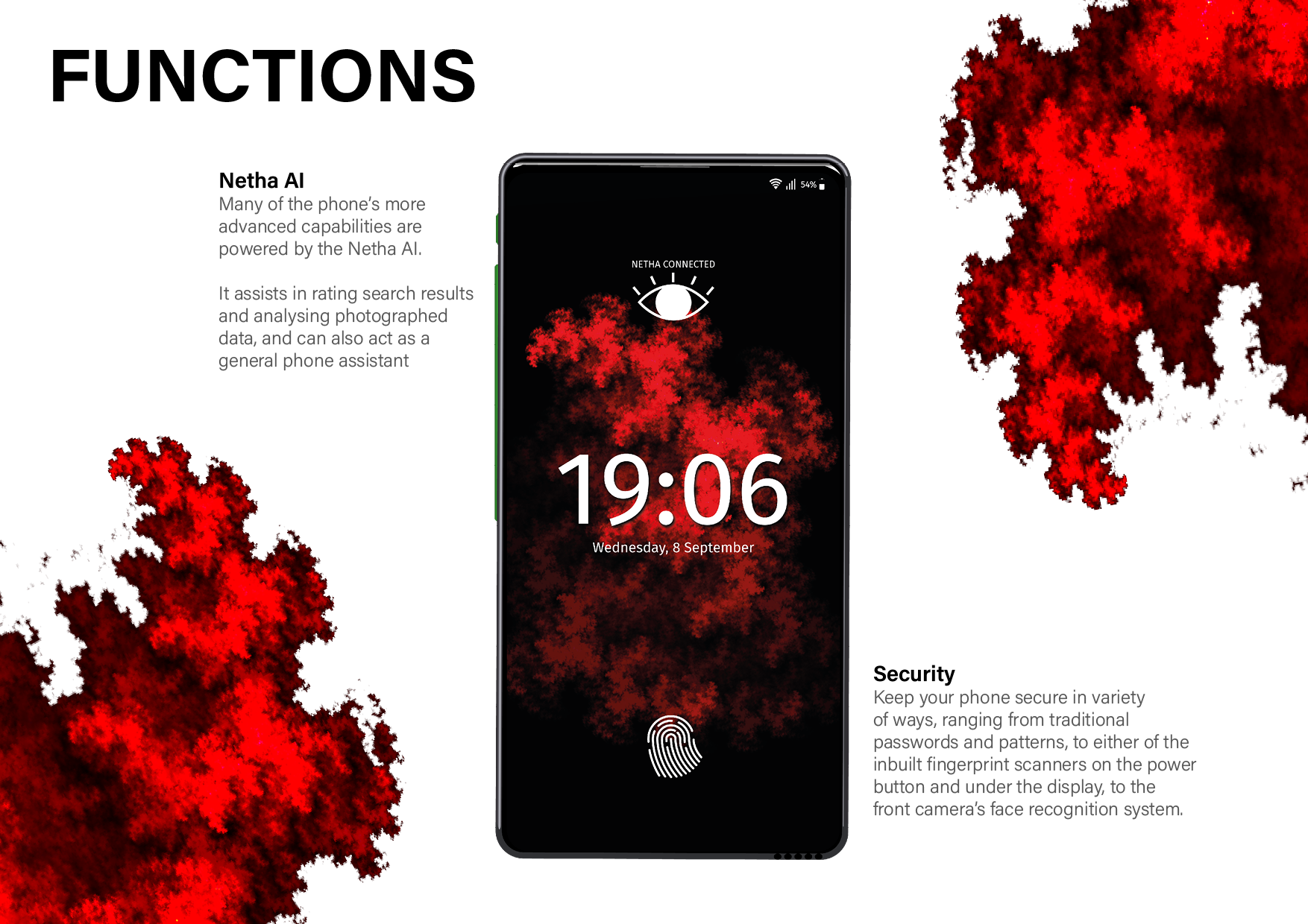
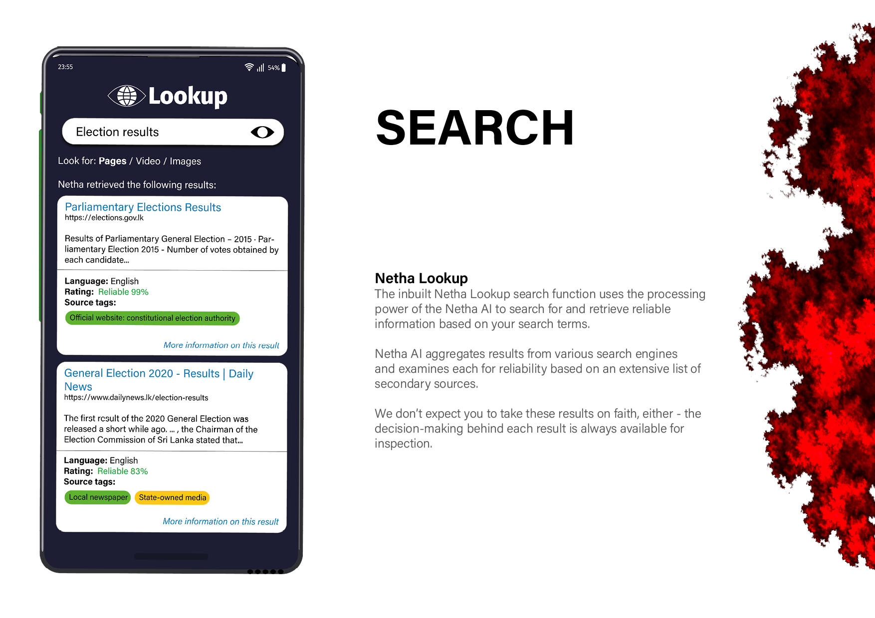
I received feedback that the brochure initially looked too plain. I had been using procedurally generated fractal patterns for graphics on the device. I decided to use these fractal patterns on the brochure as well, which worked quite well and helped make it more engaging.
Final Thoughts
I was able to use this opportunity to learn a little bit about communication design. While it wasn't the specialisation of design that I wanted to go into, it was useful to understand the process of creating visually appealing ways to communicate large amounts of information to my users, which is something that I found difficult at the time. I was even able to carry over these learnings into my UI practice.

