Type: Personal Project
Role: Background research, UX design, frontend development
Tools: Angular, Bootstrap
Year of completion: 2021
Role: Background research, UX design, frontend development
Tools: Angular, Bootstrap
Year of completion: 2021
The Challenge
During the pandemic lockdown in Sri Lanka in 2020, I was confined to my home, and was finding the "new normal" very disorienting.
I found myself unable to do anything but work and sleep, and so I developed an interest in time management techniques that I could use to organise my day, since it was no longer broken up by a regular commute to work.
I came upon the Pomodoro Technique, created by Francesco Cirillo, and had some success with implementing it. I wanted to be able to do it on my phone, and connect it to the tasks that I was doing at the same time. But the existing apps and web pages I found at the time either did one or the other. Either they were timer apps, or to-do lists. So in my spare time, I began developing a web app that combined both into one easy site.
The Solution
I decided to create a web app, as opposed to a mobile app, as I felt the functions I wanted weren't complex enough to warrant one. I looked at sites like pomofocus.io for inspiration. (At the time, Pomofocus only provided a pomodoro timer, but upon going back to the page just now, I'm pleased to see that they have since added a to-do list function, similar to TODO/POMODORO.)
I chose Bootstrap as the CSS framework for the new app, and Commissioner as its main typeface. I chose this typeface for its legibility, wide range of weights, and easy access through Google Fonts.
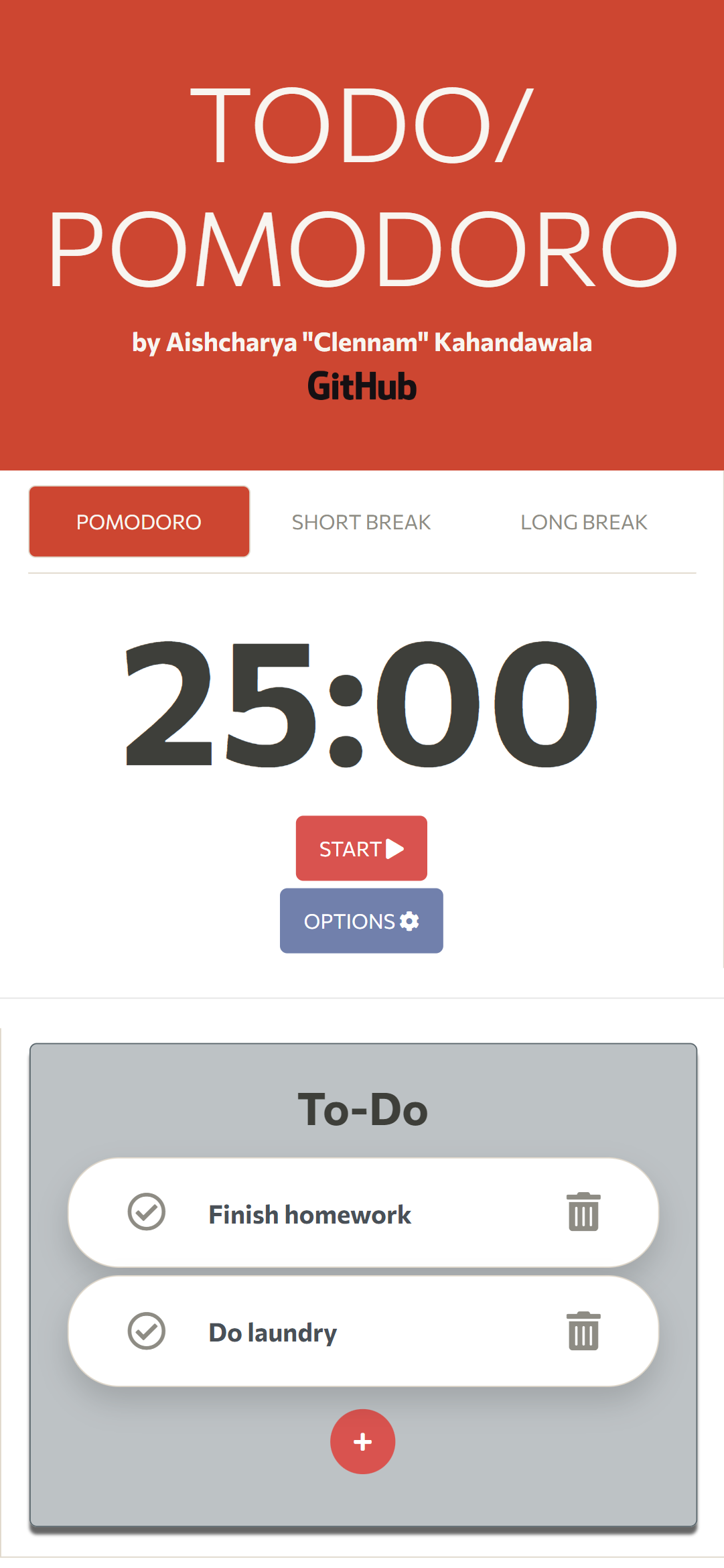
The app has a predominantly tomato red colour scheme, to evoke the pomodoro (tomato). The app is laid out with mobile in mind first, although it also displays well on desktop.
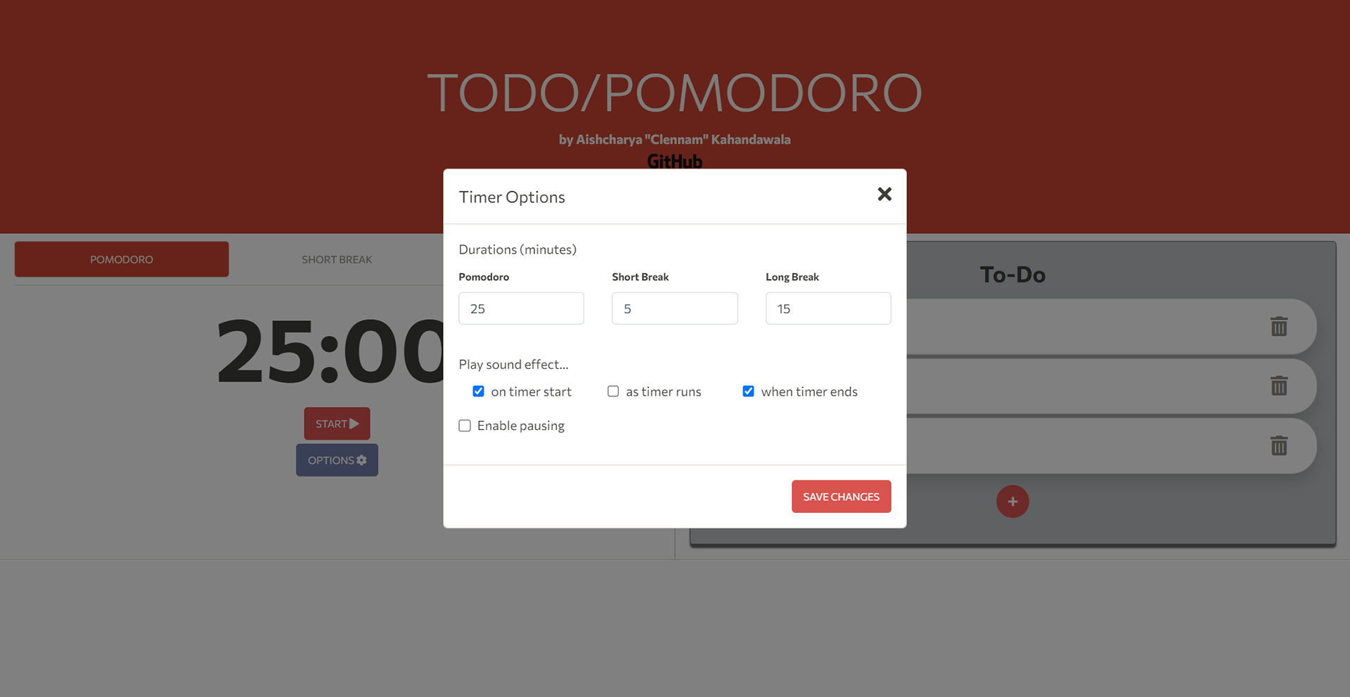
It comes with options to change the length of each of the pomodoro technique's phases, add in the ability to pause (which I felt would be nice to have), and play sounds as the pomodoro ends and while it counts down. I carefully chose the sound that plays while it counts down to keep the time limit present in the user's mind but avoid being distracting. It fades into the background, like the ticking of a clock.

Mobile

Options
FInal THoughts
Through the process of researching, building, and deploying this app, I was able to get some of my earliest experience doing what I would eventually come to know as design research. I was also able to work with Github Pages and, best of all, I was able to actually use the app to help me organise my time and become more productive, which, to me, was the mark of a job well done.

